Areas and activities: colour vs. texture
Two orthogonal axes for your day: colour for what part of life a block belongs to, texture for what kind of energy it asks. Why a planner needs both.

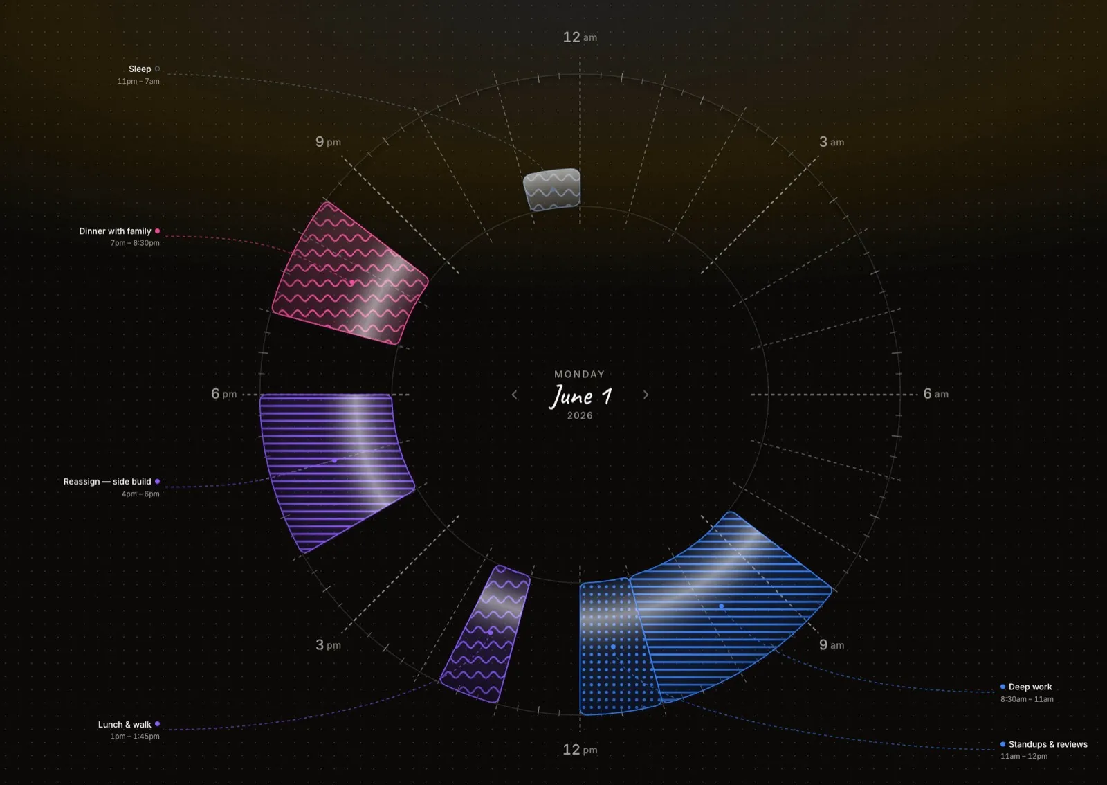
Two blocks sit on the dial, the same size, the same hour. One is a client call. One is the deep, quiet stretch where you actually build the thing the client called about. Both are “work.” On a list they’d be two identical lines. But they are not the same, and you know it in your body the moment you read them: one drains you, one feeds you, and a day that can’t tell them apart can’t be planned well.
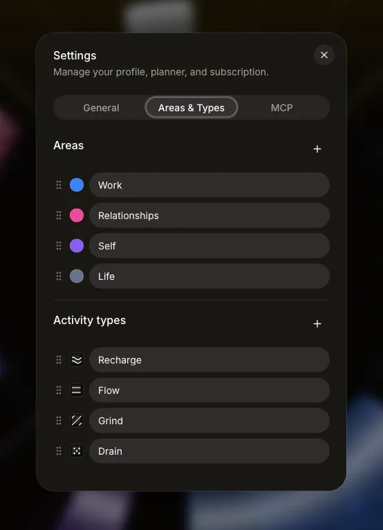
So Reassign describes every block along two axes at once. Area is a colour: what part of your life this belongs to. Activity type is a texture: what kind of energy it asks of you. They’re independent on purpose, and that independence is most of the point.
Colour is where in your life
An area answers a single question: which life is this? Work, family, health, the side project, the slow domestic maintenance of being a person. You pick the colours, and once you have, the day stops being a flat sequence of obligations and becomes legible at a glance. A morning that’s all one colour reads as a morning that belongs to one thing. A day streaked through with four colours reads, instantly, without counting, as a day pulled in four directions.
This is the same argument as why a day is round: you want to see the shape, not read it. Colour is how the dial encodes belonging. You don’t tally how much of the week went to work. You look at how much of the ring is blue.
Texture is what kind of energy
Here’s where most planners stop, and where the day gets flattened. Because “work” isn’t one thing. There’s the heads-down build that needs an unbroken stretch and silence. There’s the meeting that needs your face and your patience. There’s the shallow admin you can do tired: the inbox, the expense report, the thing you keep not filing. Same colour, three completely different demands on you.
Activity type is the second axis: a fill pattern laid over the colour. Deep work, meetings, admin, rest, movement, errands, whatever vocabulary fits your life. It says nothing about which life the block belongs to and everything about how it will feel to be inside it.
Colour tells you the day’s allegiances. Texture tells you its weather.
Why they have to be separate
The temptation is to collapse the two, to make “deep work” its own category and be done. But energy cuts across your life, not down it. Deep work happens in your job and in your side project and, honestly, in parenting. Admin shows up in every area you have. Rest is rest whether it’s a work break or a Sunday.
Fold energy into area and you lose the question you most need answered. It isn’t “where did my time go,” but “what did it ask of me?” Two orthogonal axes let you ask both at once. You can look at the dial one way and see a day that’s 70% work. You can look at it another way and see a day that’s 70% draining: three meetings and a pile of admin, with the one restorative block crushed into the corner. Those are different problems. A single axis can only show you one of them.
And the fix follows from the seeing. A day heavy on one texture is a day to rebalance: push a meeting, guard a stretch of deep work, let a genuine rest block keep its size instead of getting eaten. You can’t protect a kind of energy you can’t pick out from the rest.
Handing the read to Claude
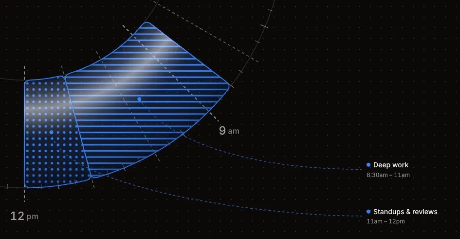
Because the two axes are real data on every block, they’re also legible to Claude over MCP. When you plan your day with Claude, it isn’t guessing from titles. It reads the area and the activity type directly. “My afternoon’s all meetings, find me ninety minutes of deep work before the day fills up” is a question Claude can actually answer, because the day already knows which blocks are meetings and which are the quiet kind of work. It looks first, proposes the shift, and you watch it land on the dial.
Colour and texture. Where in your life, and what kind of energy. Hold both at once and the day stops being a list of things you owe and becomes a picture you can read. And once you can read it, a thing you can fix.